Sunday, April 5, 2020
Thursday, April 2, 2020
Friday, March 27, 2020
Wednesday, March 25, 2020
Evaluation 2 : 2.How do the elements of your production work together to create a sense of 'branding'?
Tuesday, March 17, 2020
Final Double Spread Page
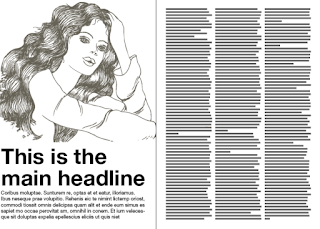
The double spread pages came out very nice as well. I also did not make any changes to the pages because I liked how they already looked. I'm glad I added the star background for it made the pages less plain. It also connects with the front cover page which I believe connects the feature page with the front cover.


Friday, March 13, 2020
Final Table of Contents Page
I like how the Table of Contents page also came out. It looks simple and not overloaded with information. I did not make any changes, not even add the star background because I felt as though seeing the pattern repeatedly would make it boring. Even though I did not alter the models in the photo, I did place a filter. This was cause of the images had different lighting and this change made the page look more natural.
Overall the page came out better than expected.

Wednesday, March 11, 2020
Final Cover Page
This is the final outcome of my magazine cover page. I did not make any major changes other than adding a barcode on the bottom left corner as well as adding the stars to the background. Since adding stars to the background in the double spread, it looked like it was missing in the front cover. The addition of the barcode simply made the magazine look more official.
Overall, I am satisfied with how it came out. There was balance between the colors, it didn't look overwhelming, font is easy to read and it feels like it would attract the eyes of a potential audience.
What I like most is how the picture of the model fits with the background in a way that it does not look so awkward.

Thursday, March 5, 2020
Color Scheme of Magazine
In designing the magazine, I preferred to keep the colors consistent. However, while it may seem plain or boring, I find that it is more organized and simple. It has a minimalist style. It also keeps from jumping out with an overwhelming of colors or information. White is also included on the color scheme however, placing it in the post would have it disappear.


Monday, March 2, 2020
Double Spread Page - Layout (Part 2)
This is the second page of the double spread. This page only consists of graphics and text, I made the decision not not add more images of the person being featured because I felt that it would take away from the story being told.
I started with a page that has the light blue color as the background.
I then made two separate columns like the first page. At this point I also implemented the feature story into the pages. I also placed a page number at the bottom right corner. The font style is the same as the first page but the font color I decided to use black and not navy blue because I felt the navy color would be to hard to read since the background color is also blue. After finishing the text, the page once again looked plain so I added stars. I made the star color white and made the transparency also to 51.


This is the outcome of the second page of the spread. Even though it doesn't have any images, I like that there are no distractions from the story. The stars add a little more vibrancy to the page and doesn't let it look so plain.

Friday, February 28, 2020
Double Spread Page - Layout (Part 1)
Using Canva, I started with two separate pages. I wanted to continue the navy blue and light blue color scheme, I made the background color of each page those color.
 Since I already have the image, I will only resize the image so that it would fit a majority of the first page of the double-spread. This page will consist the navy blue background, the title and the text.
The bottom of the page that consists of empty space is where the feature article will start and continue on into the next page.
The font for this page will differ from the next page. Since the background is navy blue, I made the font white so it would easier to read. I also chose a simple font, Montserrat Light so it could be legible.

 This the the title of the feature article. I placed it on the image on the white background. The title is noticeable, especially since the font color is also navy blue. For the font type, I used the Playlist Script, just like the masthead title for the cover page. Since the image shows the model dressed elegantly, I felt as though this font style went along with the elegant theme.
Upon completing the first page, I realized it looked plain. I decided to add graphic to the background of where the text belong. Since Canva supplies different graphics, I used their stars template. I increased the size of the stars and changed there color to the light color blue. However, since the font text was white, the light blue stars would blend with the text and make it hard to read. To fix this minor issue I adjusted the transparency to a 51.
 This is the final outcome of the first page of the double spread.
The next post will go over the second page of the spread.
 Since I already have the image, I will only resize the image so that it would fit a majority of the first page of the double-spread. This page will consist the navy blue background, the title and the text.
The bottom of the page that consists of empty space is where the feature article will start and continue on into the next page.
The font for this page will differ from the next page. Since the background is navy blue, I made the font white so it would easier to read. I also chose a simple font, Montserrat Light so it could be legible.


The next post will go over the second page of the spread.
Tuesday, February 25, 2020
Double Spread Page - Photo Shoot
For the feature article, I decided to use only one photo that the featured person would like to use. The image provided was one from her Quince, a celebration of a young girl transitioning into a young women.

She chose this image because this is when she felt the most love for herself. She felt beautiful and empowered. She was proud of herself despite all the obstacles she faced.
The image itself does not and will not be edited in a way. Even though she is wearing make up and has her hair done, it does not go against the magazines message. The magazine is to have teens feel comfortable in anyway that they feel comfortable, so if they wish to wear accessories such as make up, they can. Its about spreading positivity on body imaging.
Saturday, February 22, 2020
Double Page Spread - Development Planning
Since this will be a double page, this is where the feature story will be placed. There are different ways to layout the double spread, so I need to make sure the photos I take compliment the page as well as the story being told.
Models:
The model used for the feature page will be the same model on the front cover. I decided to stick to the basics of magazines where their front cover holds a photo or wording for the feature story. This is used to attract attention.
Font:
The font will differ depending on what part of the double spread aspect it will contain. For instance, the heading of the page should be a bigger and colorful font, one that differs from the background of course, but subheadings which is typically used to describe the part of the story that is being told. Subheadings can also be questions. Despite that, the subheadings will be a different color as well as a different font different size. The font characteristics that will be needed for the actual feature will be a basic font that is legible and stands out from the background.
Photo Shoot:
This photo shoot will differ from the others. Since it is a feature story, I want the person who is being features to be comfortable with the image, plus I want it to be an image that has a major significance to them and that is represents their journey as well as their accomplishments.
Layout:
 The layout will be different than a normal magazines double spread since I am considering going for a more square shaped magazine. I realize going for a different shape may attract attention and it will make the magazine more unique.
Going more in depth with the double spread, I really like the layout I have placed on the left. Its simple but can get the point across. However, where the feature story will take place, it seems like too much words. I will be sure to use a different layout and try to add more photos of the model or some graphics to add color to the pages.
Sources
Nikola. (2013, May 4). Magazine Spreads – Good and Bad Practices. Retrieved from http://www.magazinedesigning.com/magazine-spreads-good-bad-practices/
Tuesday, February 18, 2020
Feature Story - Article
*In making of the article, I would go back the the person interviewed and receive direct quotes from her that were not in the responses from the original interview.
Beauty isn't everything. Especially not to Bella Garcia, a 15-year-old girl who learned this lesson at a what could be considered a young age.
Beauty isn't everything. Especially not to Bella Garcia, a 15-year-old girl who learned this lesson at a what could be considered a young age.
"True beauty is from within. Not how tall and skinny you are or how soft and straight your hair is. It's about the type of person you are, and I'm happy that I have come to learn that myself."
However, Bella Garcia wasn't always so positive when it came to her body. She went through the challenges of growing up within a society that valued perfection. Most of her challenges came from how media represents teen girls and the part was how people she knew, her family and friends, talked to her when it came to her body.
"I was always the chubby one. My mom kept saying it was baby fat, trying to keep myself positive about it but I knew it was a lie. When my friends would talk about my weight I would laugh with them. I turned it into a joke so no one would make fun of me... I thought it was helping, but in reality I just kept hurting myself."
When a word is repeated over, and over again, it becomes to feel true. It becomes a part of you. And it certainly does not help when your family mentions it many times.
"Whenever I was meeting with my elderly relatives, they would always call me "gorda" which is Spanish for fat. I would usually brush it off but I knew deep down it hurt." Bella would try to tell her family how those comments made her feel, however she felt they never really understood.
"My mom would tell me to brush it off, to ignore what they are saying... I tried but it never really worked. I would breakdown. That's how I started falling into a pit of self-hatred and it seemed like there were no escapes."
That was until things turned for the better.
"I started listening to K-POP. There are many groups that make music for this genre but there is one particular group that had moved me the most, BTS."
BTS is a famous K-POP group in South Korea consisting of seven members. They differ from many popular artists from today by making songs about self-love and never giving up on your dreams.
"I listened to there songs. They were so moving, every once and a while certain songs would pop up and I would just cry. Of course, while becoming a fan of K-POP I was ridiculed by everyone who disliked it. Thats when I learned not to worry about others peoples opinion because they will always have something negative to say whether it's about you or about something you love. There is always negativity."
That wasn't the only thing Bella learned from the K-POP group.
"Once I became a fan, after looking at all their translated lyrics, I realized I needed to make a change. I was worthy. I also wouldn't be the first person to learn to love themselves from BTS."
Once gaining the motivation she never had before, she decided she needed to make a change about the way herself and the only way that was going to happen was with her.
" I started by thinking positive thoughts about myself. Whenever I tried on new clothes, I would always think of something negative however, every time I had a bad thought, I would prove that it was a lie... I had to keep in mind that these "teen" girls were edited into perfection. I am human and it would be impossible for me to ever look like that. Not even with all the plastic surgery can change who I really am."
Bella has stated numerous times that the journey to self-love is not easy and will most likely not happen over night. Even her own journey isn't complete.
"I can say that I have improved and I am more optimistic about myself than I was before. I am more determined about not forgetting that I am loved by others and most importantly that I am loved by myself."
Despite still learning the aspects of self-love, Bella wants to help other teens and guide them into loving themselves. According to Bella, society and media representation is one of the main issues as to why teens are suffering with low-self esteem. That teens harm themselves in order to become perfect and its an issue that hasn't been seriously addressed.
"Society needs to step up in a lot of different ways. As a diverse society, we need to become more accepting of others, no matter their shape, size, color. In the end, we are all human and we live on the same planet. It's pointless to bring each other down."
Thursday, February 13, 2020
Feature Story - Interview (Part 2)
This is the second part of questions and responses from the person I interviewed.
- Is there any steps of the process that you may have wanted to do differently? - No, I wouldn't. Even though I encountered most of my journey alone, I was finally comfortable enough to open up more with my family and friends. I was also able to help them by showing them what I did and suggested to them to use my method, which is listening to music, thinking positively about yourself, and in the end, just not to care about what other think.
- Would you recommend others to do it as well? - I would, however I cannot guarantee that it would work everybody. Everyone is different. How they process things is different. What they listen to, how they think, etc. We are all different. Yet, if they are willing to try anything to boost their self esteem, to reduce the self-hate, I think its worth a shot.
- Did this process work for you? - I'm still in the process because well, it just doesn't happen over night. I can say that I have improved and I am more optimistic about myself than I was before. I am more determined about not forgetting that I am loved by others and most importantly that I am loved by myself.
- What would be your advice for those who are struggling with low self-esteem? -
- What steps do you think society needs to take in order to improve the views of body imaging? - Society needs to step up in a lot of different ways. As a diverse society, we need to become more accepting of others, no matter their shape, size, color. In the end, we are all human and we live on the same planet. It's pointless to bring each other down. As I mentioned earlier, we also have issues with media representation of teen girls and teen boys. Media companies need to understand how their marketing tactics are in fact harming those who they want to be potential customers. If we saw more people on T.V. that looked like us, we wouldn't have so much negativity among ourselves.
Monday, February 10, 2020
Feature Story - Interview (Part 1)
While interviewing the Bella Garcia, I typed her responses and made note of her tone after she responded to each question.
- When did you start feeling like this?/When did this all start? - It started when I was young. As a child/toddler I was considered to be chubby. Of course my mother always said it was baby fat, Even though I tried to take that into consideration, comments from relatives and friends, whether endearing or not. It still hurt. It still affected me. My dad, my grandmother, and any older relative would call me "gorda" which means chubby or fat in Spanish.
- Did you ever keep it to yourself? - In a way yes and in a way no. I would make comments about it to other but in a joking manner. As long as I laughed along, I could get through it. There would be times where I would break down and vent to my older sister. Tell her how the comments of other made me feel. I would tell my mom how it affected me as well. Usually my mother would tell me to pay no mind to what others had to say.
- Did you ever try to seek guidance? - No. Not really. I felt as though I would be told the same thing,"Lose weight, eat healthier, your fine the way you are". They just did't seem to get through to me. Nothing that they would say would make me love myself, maybe just for a second or a day, but the feeling wasn't permanent.
- Has the way you were feeling ever affect the people around you? - I didn't think it did. I thought this whole thing involved myself, that it was my problem to deal with and anyone who wanted to a part of it had no right. I didn't think that my family or friends would feel helpless when they realized my mind was set up the way it was.
- What made you want to change?/Who made you change?/Why did you want to make this change? - What made me change was actually was in fact music.I started listening K-POP and slowly felt myself get immersed into their world. There are many groups that make music for this genre but there is one particular group that had moved me the most, BTS. Of course, while becoming a fan of K-POP I was ridiculed by everyone who disliked it. "How can you understand it if it's in a different?" or " Oh, is that those Chinese boys you listen to?" and so much more. What they didn't understand that their songs, their lyrics, had such deep meaning about self-love, following your dreams, and helping each other rather than bringing them down. Once I became a fan, after looking at all their translated lyrics, I realized I needed to make a change. I was worthy. I also wouldn't be the first person to learn to love themselves from BTS.
- What were the steps you took to improve your thoughts of yourself? - I started by thinking positive thoughts about myself. Whenever I tried on new clothes, I would always think of something negative however, every time I had a bad thought, I would prove that it was a lie and try to find the positive. For instance, when wearing a new shirt and I didn't like the way my body looked in it I would think "I look fat". But I knew it wasn't true. I would start being optimistic, such as saying, "The color flatters my skin... And the shirt shows off my best qualities." I also would start ignoring what the media wanted me to be. When it comes to media representation of teen girls, they always have perfect skin and a skinny waist. I never saw anyone like me. I had to keep in mind that these "teen" girls were edited into perfection. I am human and it would be impossible for me to ever look like that. Not even with all the plastic surgery can change who I really am.
Wednesday, February 5, 2020
Feature Story for Double Page Spread
In an earlier blog, I had made a small excerpt of the feature story. The overall theme of the feature is to provide the audience with an inspirational story of a young girl who overcame self-hate, boosted her self-esteem, and wants to show anyone who will listen to her story that they can overcome this brief turmoil.
In making the feature, I want to try to have it filled with quotes rather than using my own words, that way the person is telling the story rather than me. I feel that this will have a major effect on the audience, as if they are being told the story rather than them reading it. They may feel more motivated to help themselves to help others around them.
I will be planning to record the interview between me and the person in order to make sure the quotes are accurate.
Questions:
- When did you start feeling like this?/When did this all start?
- Did you ever keep it to yourself?
- Did you ever try to seek guidance?
- Has the way you were feeling ever affect the people around you?
- What made you want to change?/Who made you change?/Why did you want to make this change?
- What were the steps you took to improve your thoughts of yourself?
- Is there any steps of the process that you may have wanted to do differently?
- Would you recommend others to do it as well?
- Did this process work for you?
- What would be your advice for those who are struggling with low self-esteem?
- What steps do you think society needs to take in order to improve the views of body imaging?
Monday, February 3, 2020
Table of Contents - Editing Process/Final
Editing my table of content page, I wanted to keep it simple and straight to the point.
First, I started with choosing two images, one from each models.


These were the images that I chose. I felt that these were the best from their individual photo shoot. They are in different poses and can bring the diversity I want for my magazine. They are both full body shots, however, one captures the model much closer in the frame than the other.
Once I got my images I started with a light blue background, that way it would compliment the navy clue color from the front cover page.
 The color of this blue is #a2b0cc
After choosing the background color, I decided on the placement of my photos. I placed them on the opposite corners of each other. Its a simple design. However, since the lighting of the photos were different, I placed a filter on the photos that would make them appear black and white. It was on the filter Greyscale with an intensity of 50.
To continue with my simple layout, I placed the page numbers and content on the upper left corner within the outline of a rectangle. The font of the wording was Montserrat Classic and its color is the same navy blue as the front cover page. On the bottom left corner I placed the page number of where the feature story would be located. It had the same font as the other content as well as the whit outline of a rectangle.


To make it known that this page was in fact the table of contents page, in the center of the page, I placed a simple headline. It followed the same concept, with the navy blue colored font as and a white rectangle, however, the actual font differs from the one that contains the content.

After the editing, this was the final outcome of the Table of Contents page.

Friday, January 31, 2020
Table of Contents(2) - Photo Shoot
This is my second photo shoot with my second model. I took the same process, trying her in different poses and taking many photos. Between all the photos, I liked these four the best. Although, the photos came out very well I can not choose which one I would prefer. Once designing the layout for the table of content, I can choose which position would better suit it.
The only editing that will be done for these photos will be adjusting the lighting and clearing the sky from stray clouds.
Bringing this model into the magazine will hopefully bring diversity in the audience. Usually when a consumer sees someone that looks like themselves in a magazine or any type of media, they are motivated to buy that media. Despite using a model of color for marketing purposes, I want to use the model to have the audience understand that they are beautiful no matter what color skin they have, their body type, or their gender preference.


Tuesday, January 28, 2020
Table of Contents Page(1) - Photo Shoot
During my photo shoot, I took photos of my models in various poses.
I first started with my male model. I found a location that was simple and didn't have any distractions. I made sure it was a simple background because of the way I am planning to edit it.
For this particular model, these are the three photos I liked more from the photoshoot. Through evaluation, I liked his poses that were in a crouch position more than him standing up.
I will be choosing between the two photos with him in a crouched position. After picking the photo, I need to edit it. My plan would be to have a different background, where it's a simple color. However, I can also just touch up the background in the photo without making any major changes.

Including this model into my magazine, although a minor part, will first show that this is a gender neutral magazine. It will also show that men do not need to follow the typical body stereotype. The magazine is about showing teen boys that they can use products or clothing tips that may be perceived as feminine, however, it is gender-neutral and can be used by many, even if it does not have a boy on the cover.


Saturday, January 25, 2020
Table of Contents Page - Development Planning
Since this is the table of contents page, I will be going for a different type of model as well as a similar location/background. Considering this is the table of contents, there will be many words that must be legible for audiences, meaning that the background must be a simple background. I can always edit the background of the photo so it could be more smoother, however I will also not edit the model because I want to show natural beauty.
Font:
The font will also need to be chosen carefully as well as the size and color. I want it to continue to be in theme as well as have have fonts that fit with the front cover. The must be bold, or at least the page number must be bold as well as the article/heading of that page number. I must use the boldness and colors of the font in order to attract attention, thus having the audience read the magazine.
Models:
For the model themselves, I am considering the shots to take. I can take full body shots, two-thirds body shots, or close-ups. This of course will be figured out once I conduct the photo shoot and will be going to edit the photos. My plan is to choose two models for the table of contents. For my models, I will be choosing from my two previous models(not the one on the front cover). After the photos are taken, I will evaluate each of them to see which of them will better suit as the table of contents based on lighting, pose, and location.
Layout:
Here is an example of a table of contents page.
 This table of contents has color but it is also very simple and legible. I think this might be a design that I will like to go for. Where the model will be placed has a colorful background but where the words, or table of contents, are placed with a white background. That way, the words are legible, plus I can add more colors to the fonts.
Subscribe to:
Posts (Atom)
-
 This is the final outcome of my magazine cover page. I did not make any major changes other than adding a barcode on the bottom left corner...